Tabsend is a small project for sending browser tabs between devices. Yes, like the functionality already present in firefox, except this one is also going to work in Orion, and be able to close tabs on remote devices. I’m working on this thing for a couple of hours every month when I remember that it would be useful; and the last several months I’ve been stuck on the visuals, so I want to take you on the quick tour of the approaches.
Version 0 - programmer’s art
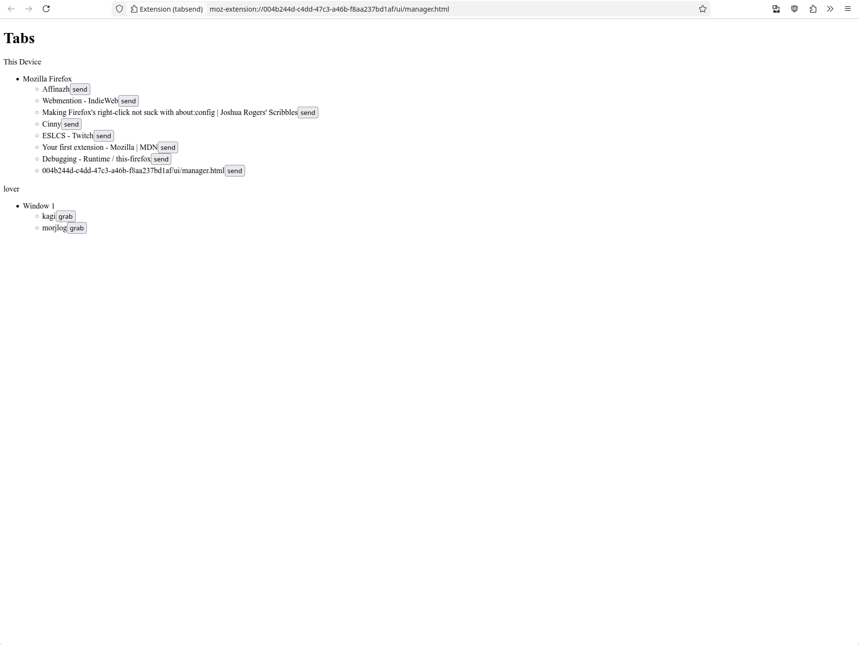
The first iteration is to just present everything somehow. HTML has a
representation of lists with ul, and even though the DOM is hierarchic, for
showing the tree-like structures you need to choose a way to present. I go
either with a div > hN, or a ul inside ul. Then sprinkle some buttons
for every supported action.
Version 1 - the vision for what I want to do
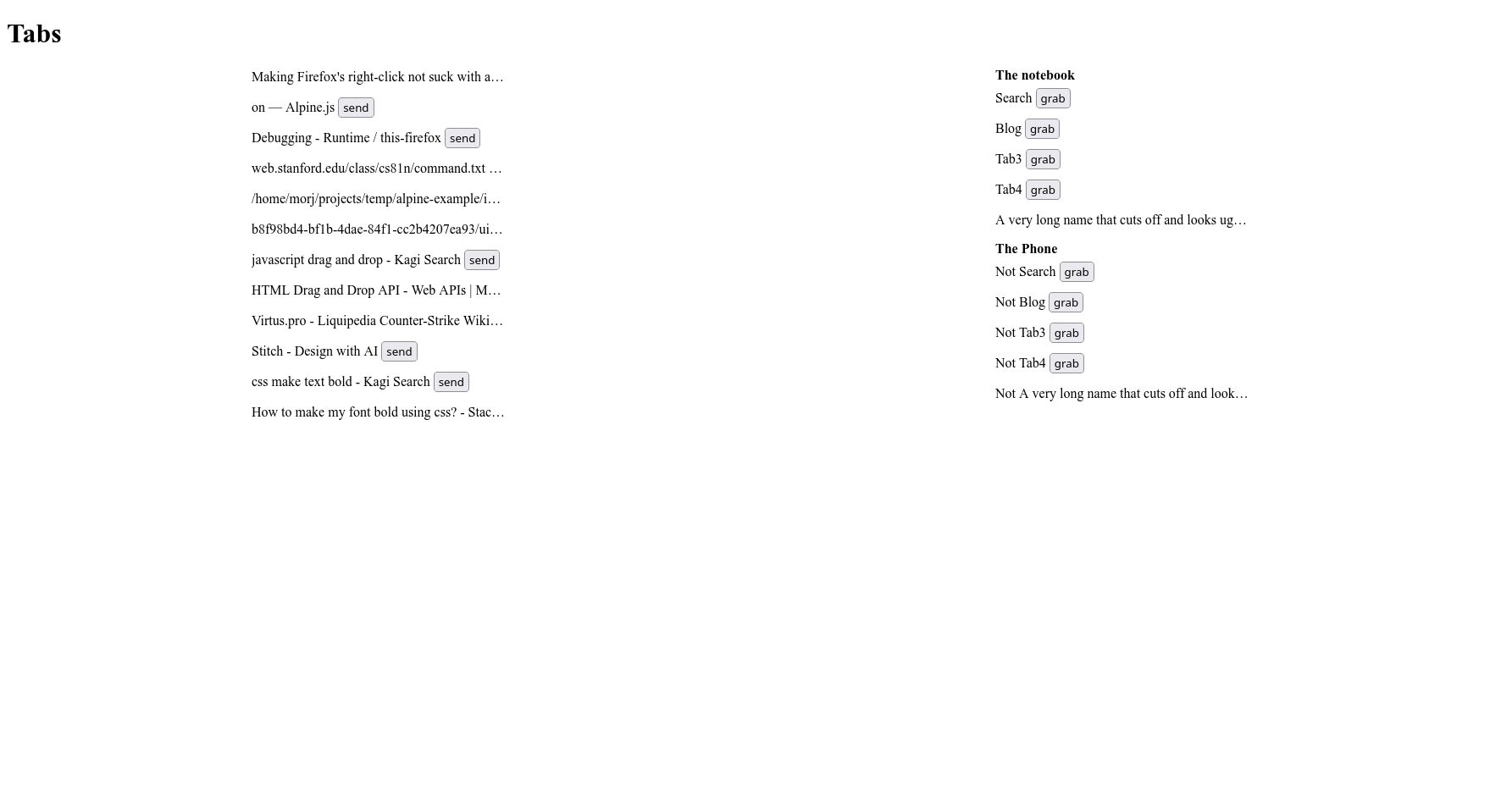
I decided that I want the UI to have two vertical panels of tabs, and the interaction to be the same as the browser tabs: a close button, and drag-and-drop between windows. The close is easy to implement so I postponed it, but the drag and drop is annoying so I worked on it for a while and abandoned
Version 2 (fake)
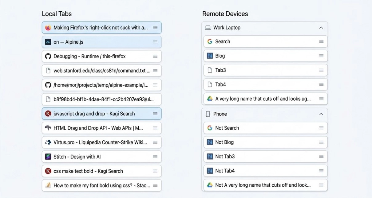
Realizing that I’m a fuck up and can’t get anything right, I tried to do what every good for nothing loser does and asked an LLM for help. Well, to be more real and charitable, it was because I had three separate so-called «friends» tell me «why don’t you try AI design? Didn’t you know it’s the future?» So I try google and anthropic using my company’s free credits. The anthropic one was too complicated and looked too much like AI, and didn’t follow my guidance to make it look like draggable tabs. This one I at first thought was alright and started implementing, until I realized that it really doesn’t spark joy. The frames are weird and overbearing, the colors are too present, and the grab handle looks weird.
The good part of this design is the affordances: from just looking you understand how everything is structured and what’s possible. The tabs belong to devices - as shown by frames. The tabs can be grabbed - as shown by the handle. It’s easy to understand where the tab starts and stops, and where to drop the tabs when dragging them. People say that modern designers have forgotten how to draw affordances, and they are right. So anyway, here’s my next design.
Version 3 - current
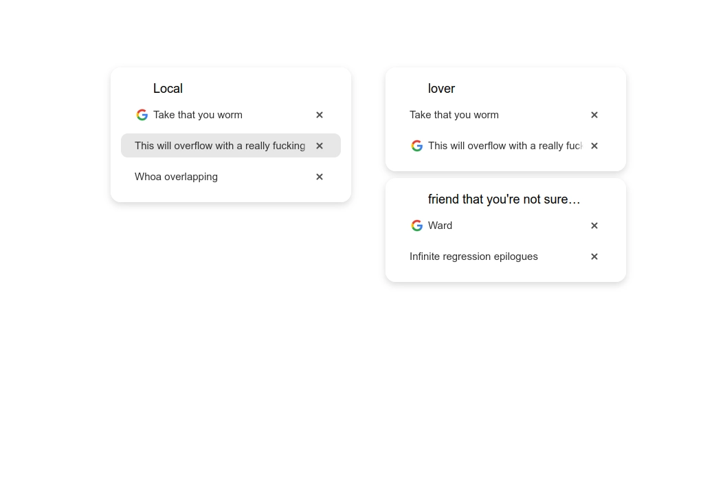
Anyway, I stole the visual language from Tahoe. When I first saw it, I thought «man, those white panes on white background, distinguished only by the shadow, are fugly». I think here I figured out how to make it better:
- Don’t put the pane so close to the window border
- Make it less rounded
- The content should have clear borders on all sides
The affordances, you may notice, are worse than above. But it looks cleaner. I think it’s possible to have both, but I’m not good enough to achive it. Does this mean that apple’s designers are as bad as me since they couldn’t achieve it too, and also since their product looks worse? At least they could come up with a new paradigm, which I didn’t, and that’s an achievement too.
Another upside of this design is that it was easier to implement than v2, I could finish it in one quick evening while also trying to understand how it’s even supposed to look like. Yet another upside is that the tabs do look like tabs, compared to all above; incredibly minimalistic tabs, but that’s how they are in firefox and orion anyway.
A reader with a good eye might notice that the offsets are all completely arbitrary. Part of the reason is that I don’t know how to reference them all, the bigger part is even if I could, CSS makes it very hard to position and size things relative to each other. Here, I wanted the device name to be aligned with the right side of the favicon, but the only control over its position that I have is its width (why does width control position, because flexbox duh).
The fact that is still looks nice despite random offsets is the advantage of the modern spaced-out design language: you can be sloppy with sizes and it’s not noticeable because the gaps are so huge you can put whatever in them. This makes me think that a lot of modern designers are as bad as modern web developers: just taking the easy sloppy path, where nothing is intentional and the mistakes are covered by trends.
The future
I’m glad the visual solution here was so simple to do in the end. I have three other parallel projects where I’m stuck on making a good interface. Will the lessons I learned here help me then? Did I even learn anything? Maybe not.